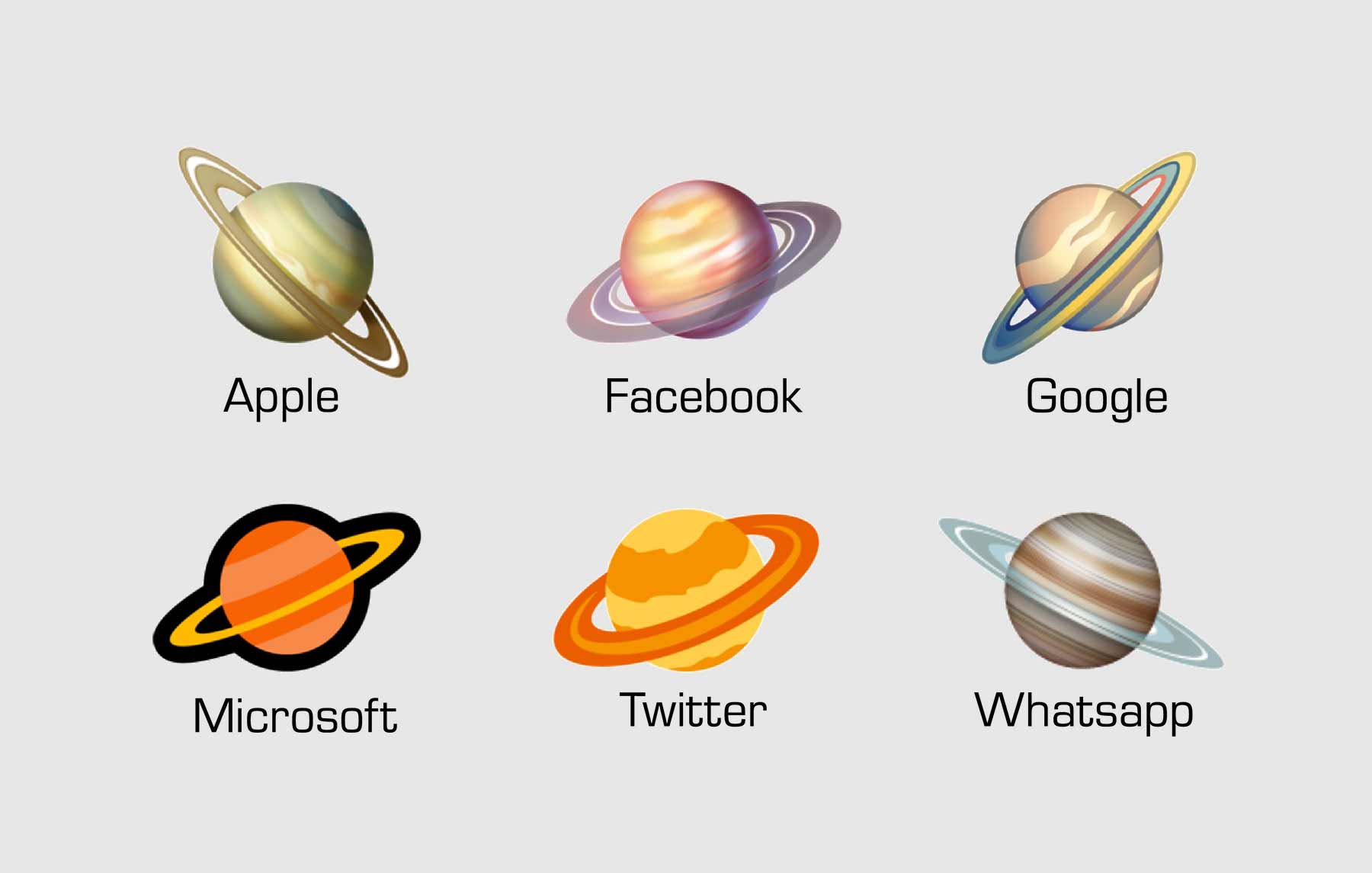
Ihr kennt das Spielchen ja mittlerweile durch die Scheren- und Ameisen-Emojis. Aktuell haben sich Experten den unterschiedlichen Darstellungen von Weltraumkörpern in Emojis auf den unterschiedlichen Plattformen auseinandergesetzt.
Zum einen hat Planetologe Dr James O’Donoghue sich den Saturn geschnappt. Ringdarstellung, Neigung, Färbung – schauen wir mal, wie wissenschaftlich korrekt (und designtechnisch schön umgesetzt) die diversen Darstellungs-Varianten sind:
I'm a planetary scientist with published papers specifically on Saturn's atmosphere/rings, so thought it'd be fun to rank the "Ringed Planet" emojis🪐
First I'm gonna assume they're trying to be SATURN ok, so I'll be ranking their accuracy based on that. Results end of thread!👇 pic.twitter.com/BVcI9EHNxf
— Dr James O'Donoghue (@physicsJ) February 26, 2020
Apple
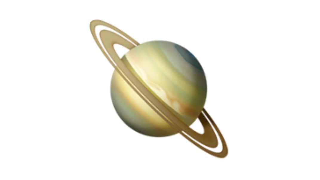
„Saturn itself – v nice job capturing the golden yellow shades of Saturn’s cloud tops, only this one definitely shows the famous polar hexagon. Overall winner in atmosphere!
Rings – well done, includes Cassini division (gap), albeit a bit large
Tilt: 45°, should be 26.7°“
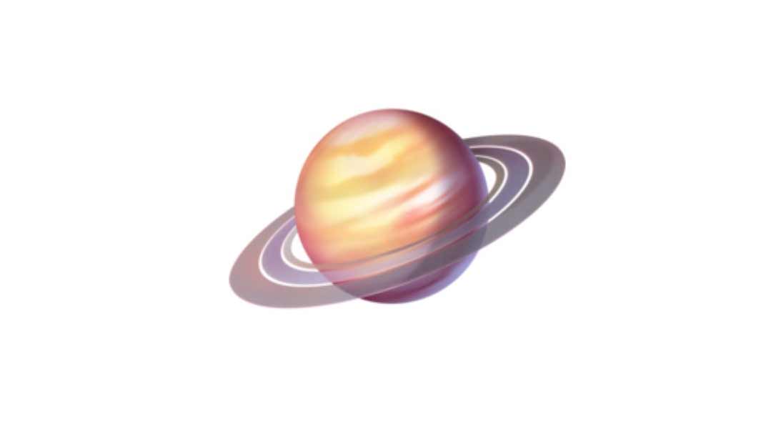
„Saturn itself – atmosphere is ok, perhaps a little too colorful, but the bands are reasonable. No polar hexagon
Rings – includes Cassini division (gap), this time a little narrow. Rings too close to Saturn, extra gap is nice tho
Tilt: 22°, should be 26.7°, v close!“
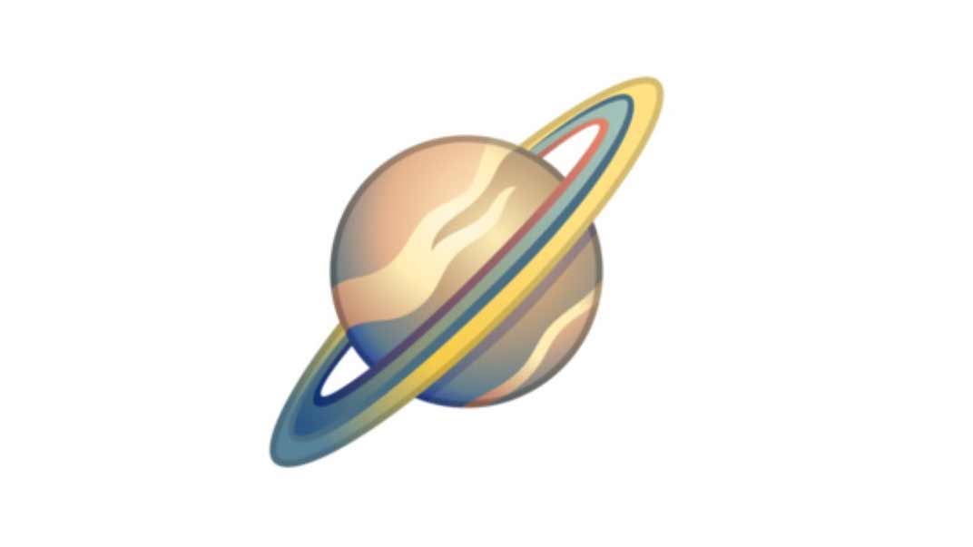
„Saturn itself – the banded structure Saturn has is not well represented here, instead exhibiting an unusual whispy appearance with no hint of polar hexagon.
Rings – no gaps shown at all, rings aren’t wide enough
Tilt: 45°, should be 26.7°, boo“
Microsoft
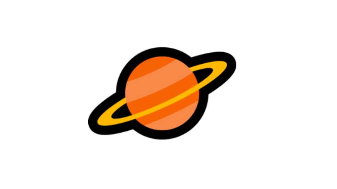
„Saturn itself – this is a simple one, but the banded structure is at least shown in an organized way. Colors disturbing
Rings – no gaps shown, rings aren’t wide enough, lack of detail. At least Google’s above showed structure
Tilt: 25°, should be 26.7°, v good“
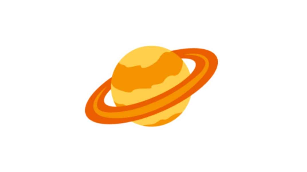
„Saturn itself – the most offensive of all. Where is the northern band going on top left? It should stay in its lane (latitude)! Makes it looks like planet is offset from rings!
Rings – how dare you, should exihibit symmetry!
Tilt: 25°, should be 26.7°, v good“
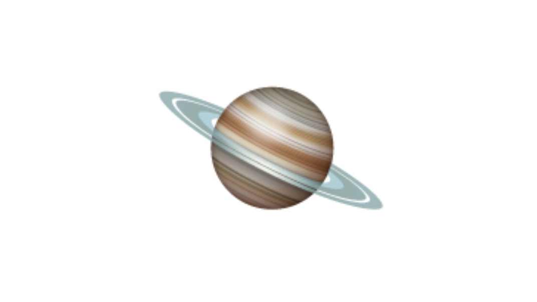
„Saturn – Banded structure Saturn looks fantastic, can forgive the colors being off. Potential hint of hexagon too.
Rings – the 3 major segments of rings (A,B,C) are shown beautifully. Shaded nicely, gap=perfect!
Tilt: should be 26.7°, measured near EXACTLY 26.7°!!“
Hier seine finale Rangfolge der sechs Saturn-Emojis:
Number 1 is Whatsapp! Apple was a close second, but I was so impressed by Whatsapp-Saturn's tilt & rings being so accurate that it was an easy choice: the rings are Saturn's crown jewels!
As I said this assumes they're trying to match Saturn, may not be true. Thx for reading!🪐 pic.twitter.com/g0FOtID7Em
— Dr James O'Donoghue (@physicsJ) February 26, 2020
Zum anderen hat sich Physiklehrer Christopher Becke inspiriert vom ersten Twitter-Thread unseren Erd-Trabenten, den guten alten Mond in all seiner Emoji-Darstellungs-Varianz angeschaut.
Inspired by @physicsJ , I decided to take a look at the moon emojis and rank them based on scientific accuracy with some consideration of artistic style pic.twitter.com/3OGUJXY1NE
— Christopher Becke (@BeckePhysics) February 26, 2020
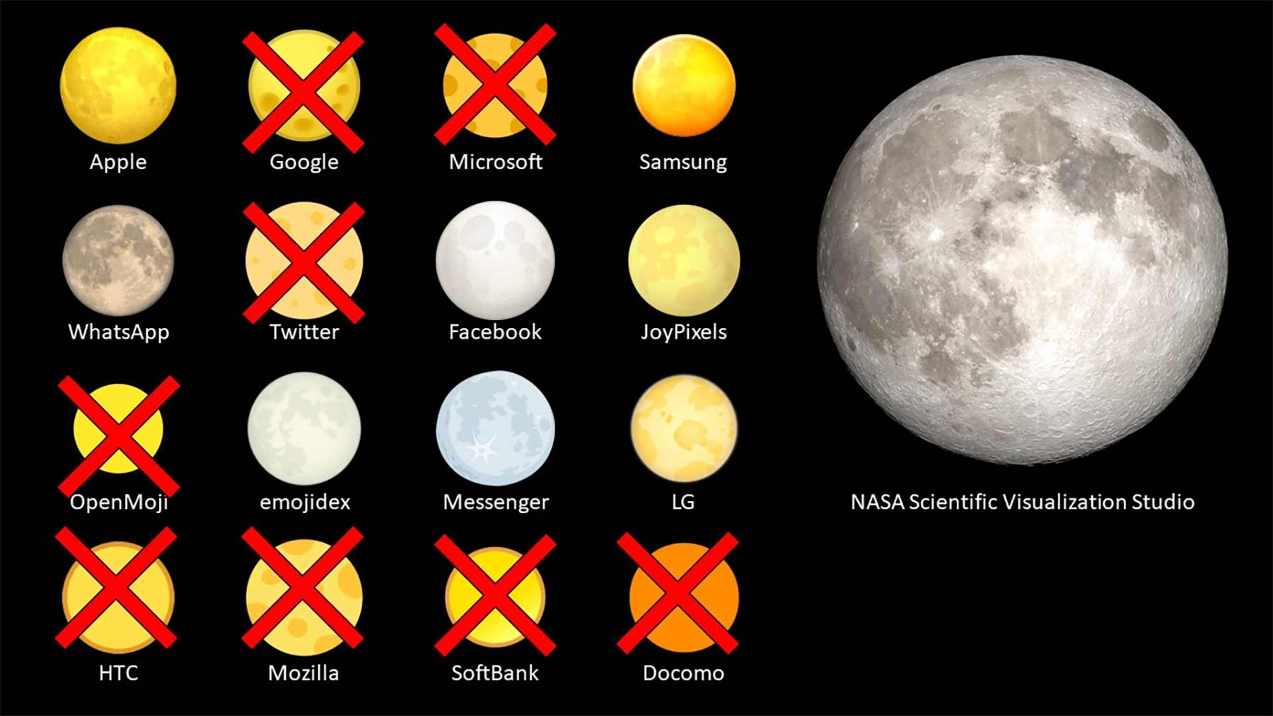
Zunächst hat er einige aus seiner Betrachtung exkludiert, die „gar nicht erst versuchen“, wissenschaftlich korrekt zu sein. Es bleiben acht Emoji-Varianten, die es zu analysieren gilt.
Apple
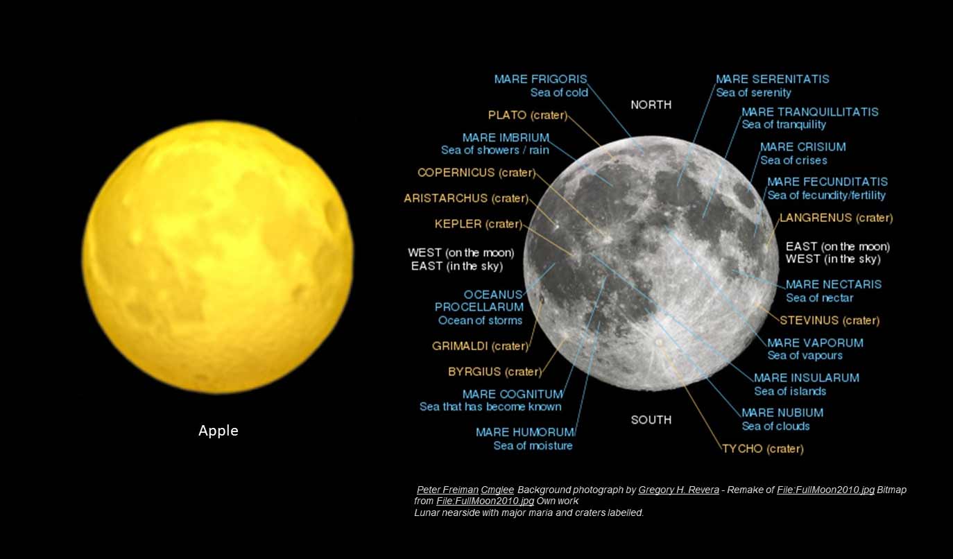
„With a labeled lunar image (credits below), we can see that Apple does a good job, although the color is too yellow and the vertical relief is exaggerated. Kepler and Aristarchus craters appear like mountains.“
Samsung
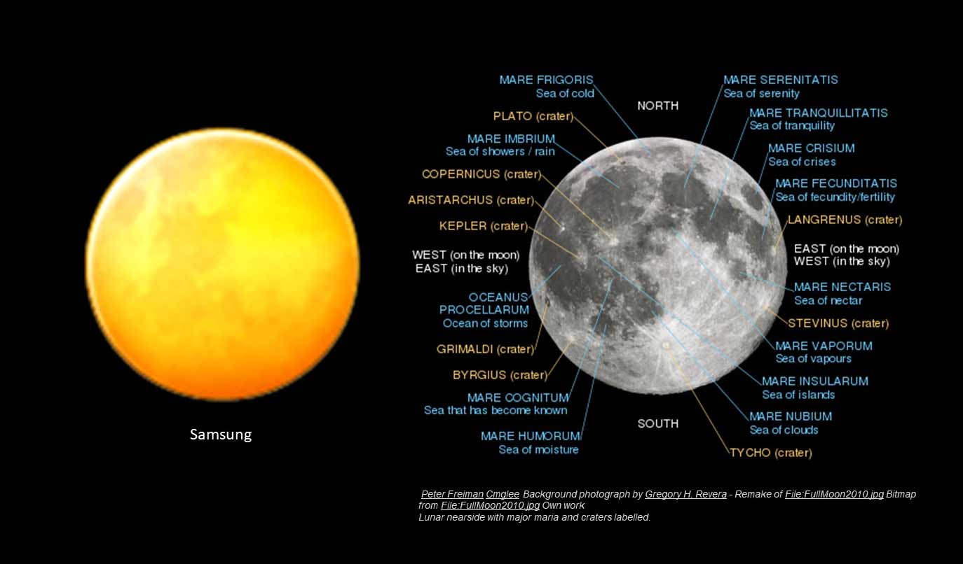
„Samsung shows less features and does not exaggerate the relief, but again is strikingly yellow. The features that are shown are exaggerated in size, with Mare Serenitatis and Mare Tranquillitatis expanded and more centered than they should be.“
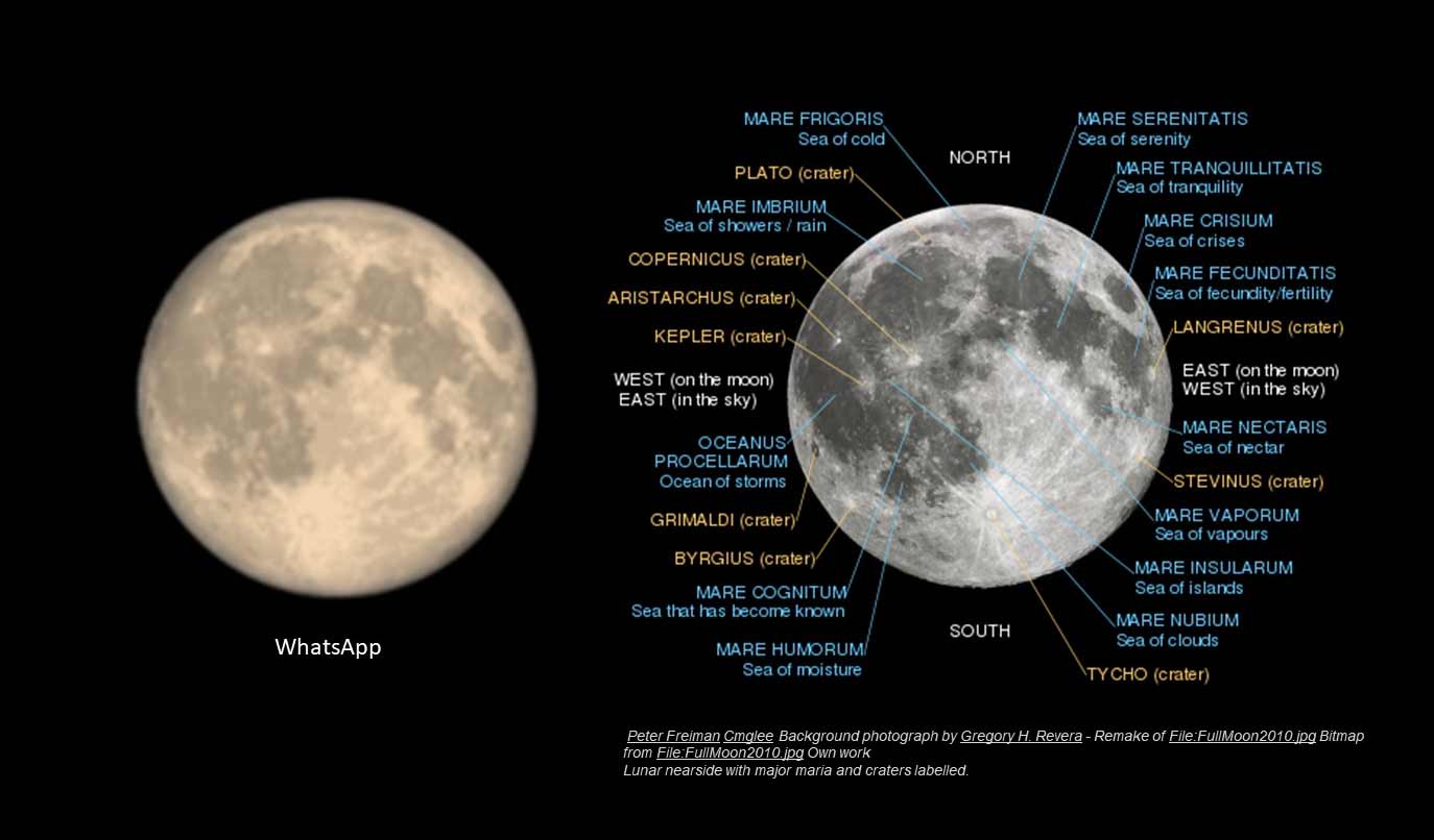
„WhatsApp is … basically a photograph of the moon. Spot on in color and scale.“
Facebook
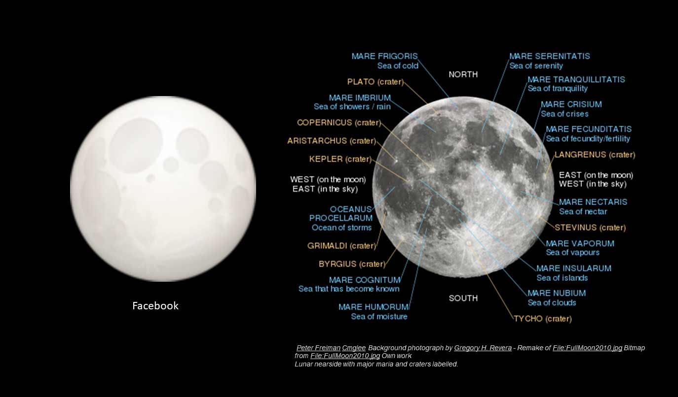
„Facebook wins some style points. Although the features are simplified, several mare are displayed in relative position, and the radial ejecta from Tycho crater is a nice touch.“
JoyPixels
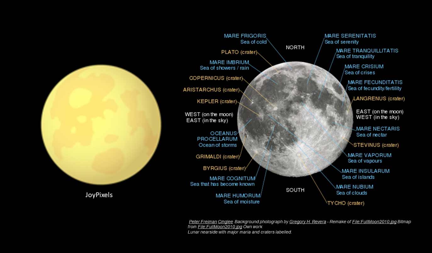
„JoyPixels does some stylization, with the seas of serenity, tranquility and fecundity somewhat recognizable. But beyond that, this could just as well be an image of Saturn’s moon Titan, especially with the yellow tint.“
Emojidex
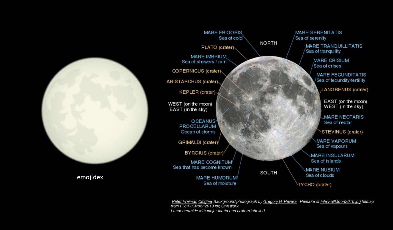
„Emojidex has subtle gray colors, and if you look closely, you can identify the mare, although stylized. Crisium is rotated too far into view, even given the moon’s libration.“
Messenger
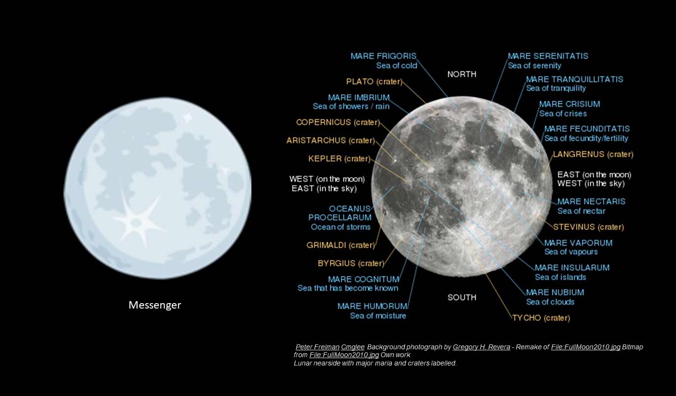
„Messenger chooses blue tints, and stylized representation of the features. But big points for the artistic interpretation of the Tycho ejecta! I kind of like this one.“
LG
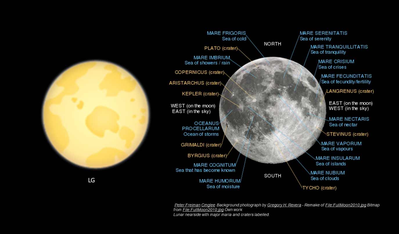
„I have no idea what’s going on with LG. Again, this reminds me more of Titan than of Luna.“

„Facebook wins some style points. Although the features are simplified, several mare are displayed in relative position, and the radial ejecta from Tycho crater is a nice touch.“

„JoyPixels does some stylization, with the seas of serenity, tranquility and fecundity somewhat recognizable. But beyond that, this could just as well be an image of Saturn’s moon Titan, especially with the yellow tint.“

„Emojidex has subtle gray colors, and if you look closely, you can identify the mare, although stylized. Crisium is rotated too far into view, even given the moon’s libration.“

„Messenger chooses blue tints, and stylized representation of the features. But big points for the artistic interpretation of the Tycho ejecta! I kind of like this one.“
„I have no idea what’s going on with LG. Again, this reminds me more of Titan than of Luna.“

Hier noch Christopher Beckes finales Ranking zum Abschluss:
Overall, I have to give it to WhatsApp and Apple for feature recognition, and Messenger for being my favorite artistic take. Go Tycho!
Your thoughts? pic.twitter.com/N4yJNymekm
— Christopher Becke (@BeckePhysics) February 26, 2020
Gerne kann die komplette Emoji-Klaviatur mal von Experten beleuchtet werden. Neben dem allgemeinen Design-Vergleich finde ich es sehr interessant bis lehrreich, Input von Experten zu erhalten, wie realistisch die Darstellungen sind. Und wer weiß, vielleicht liest ja der ein oder andere Plattform-Designer mit und verändert darauf basierend die Darstellung. Wobei auch klar sein dürfte, dass das lediglich bildliche Repräsentationen mit Unterhaltungsfaktor sind. Und, dass sie sich auch irgendwie zwischen den Plattformen unterscheiden „müssen“, im Sinne der Eigenständigkeit.
Quelle: eay










Noch keine Kommentare